National Palace Museum Labels Changing Over Time
1. The Earliest Labels at the Museum
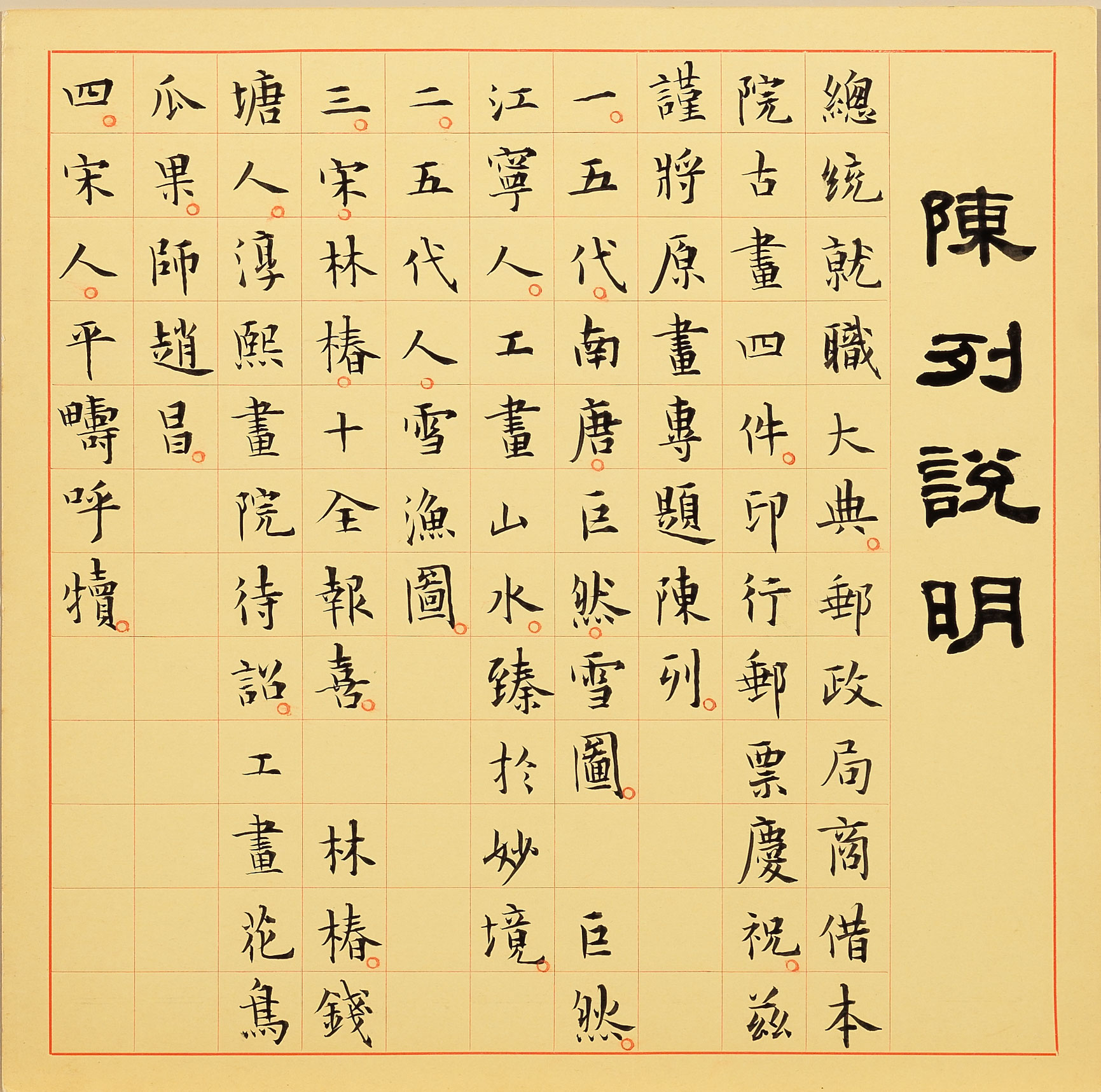
The earliest-known labels at the National Palace Museum for painting and calligraphy are large grid-red cards used after the Museum's holdings were moved to Taipei from Taichung, an example of which is seen for a Museum display celebrating a Republic of China presidential inauguration ceremony. Although the label is not dated, the four paintings mentioned in it are the same for the commemorative postage stamps issued for the presidential inauguration on May 20, 1966. This would indicate that the card was indeed used for the May 1966 exhibit at the time in the main painting display cases on the main floor of the Museum building.
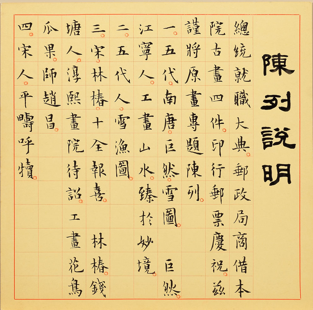
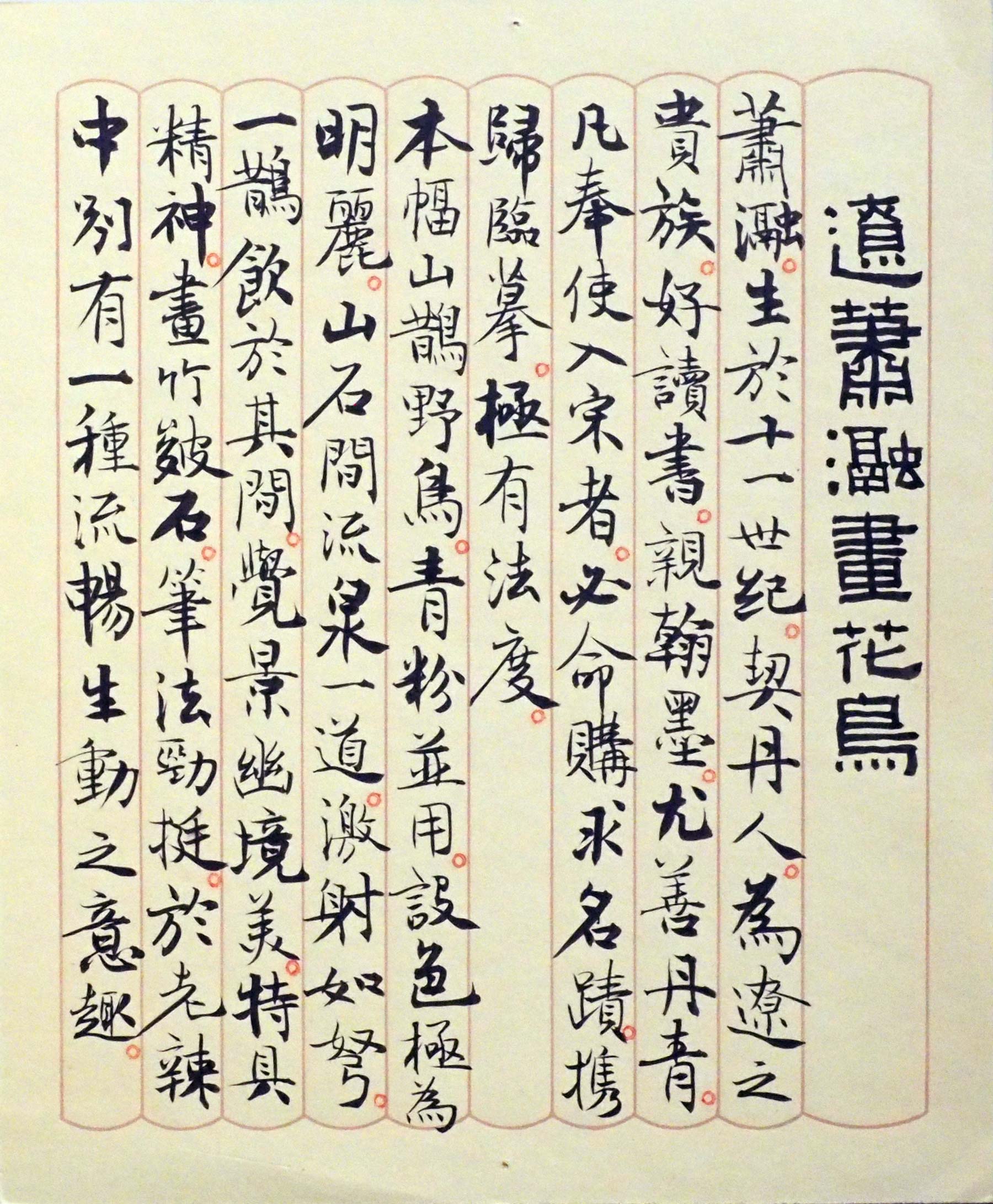
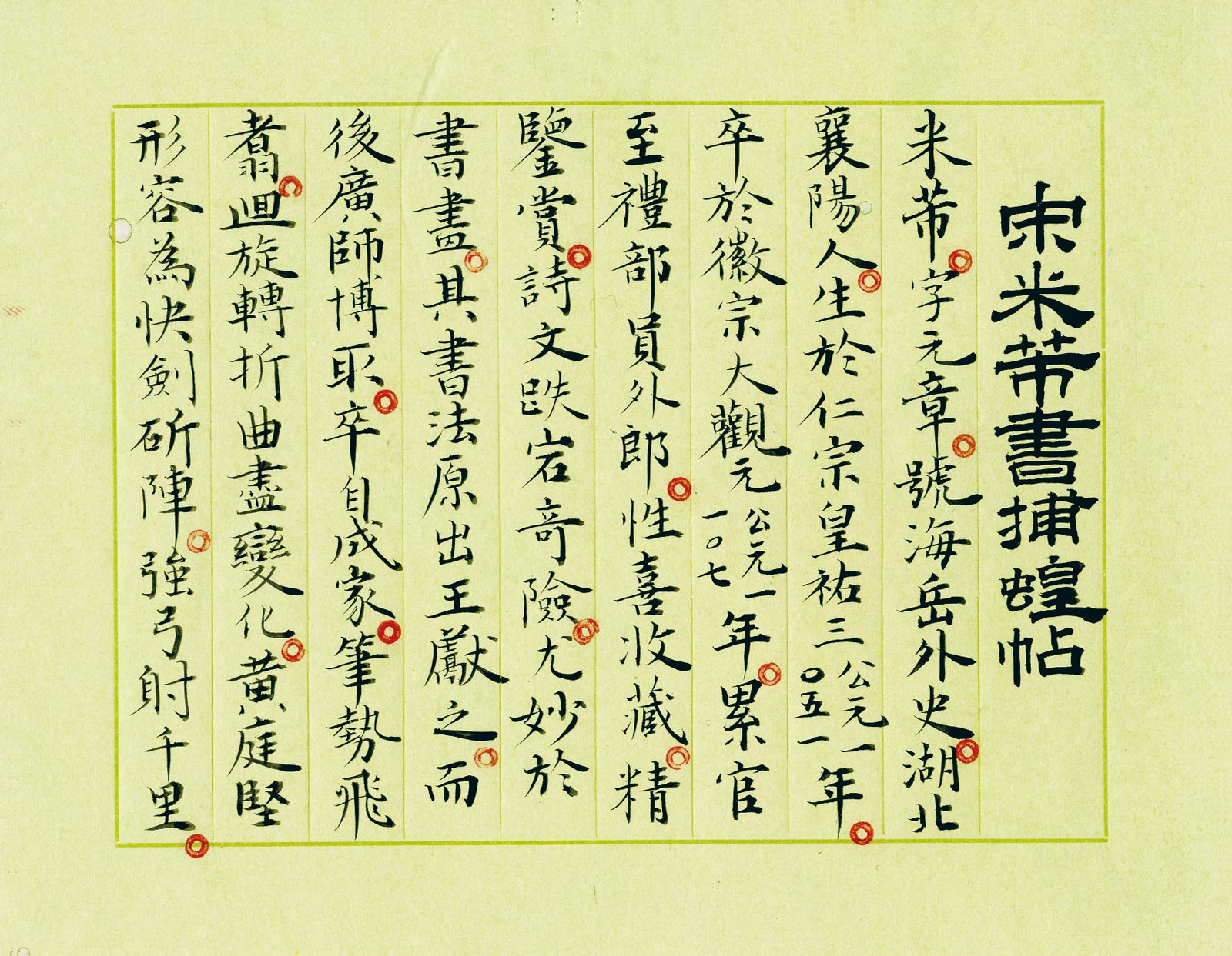
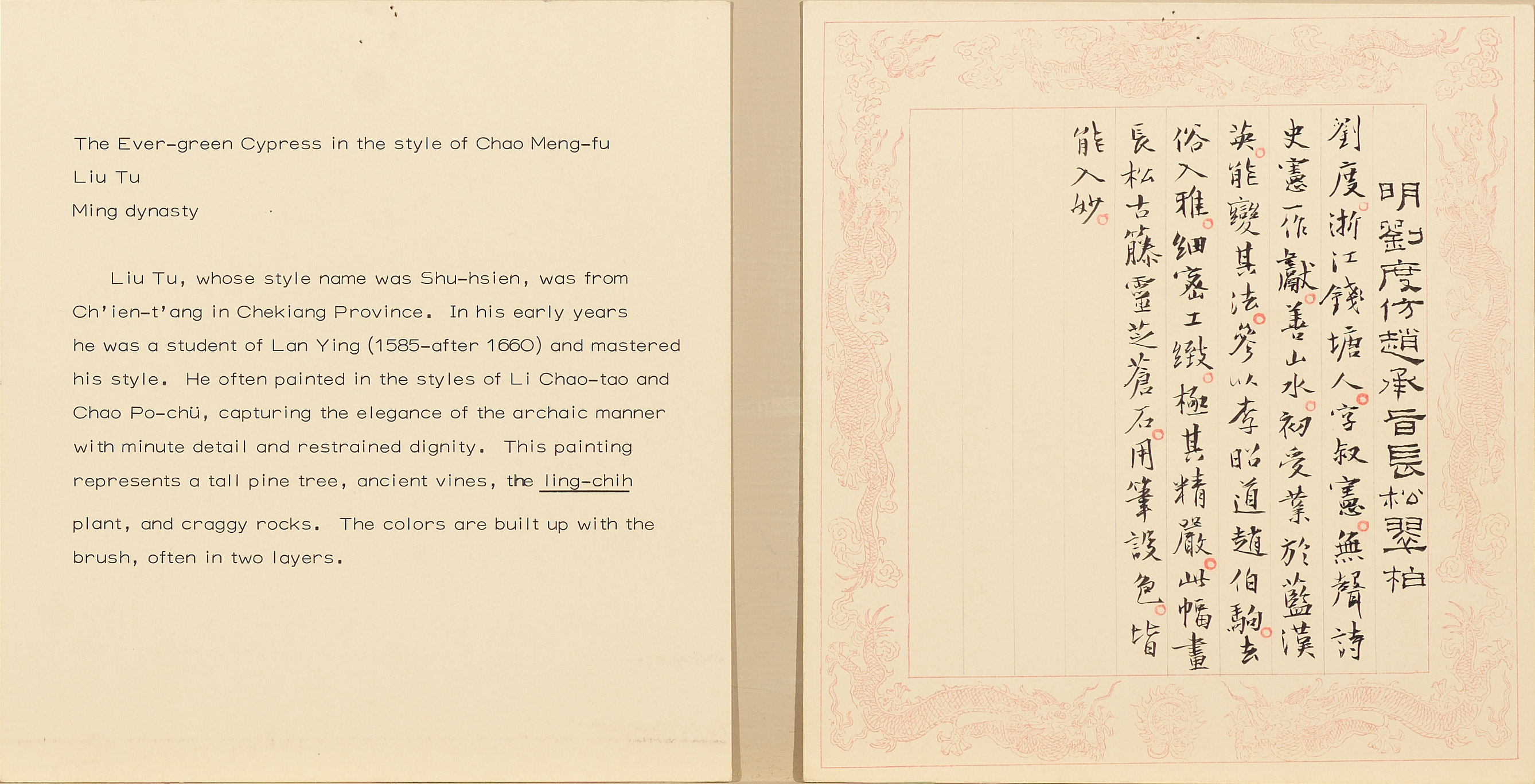
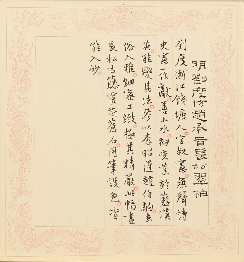
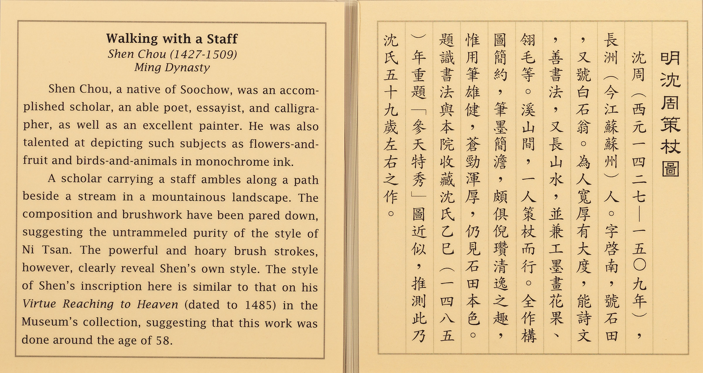
A smaller label with the grid hand-drawn in red ink is perhaps a version developed in response to a smaller display case. The column in Chinese on the left side of the label is twice as wide as those for the explanatory text and done in bolder ink to indicate the title, representing a stylistic feature of labels done by hand at that time.
2. The Ta-feng and Lan-ch'ien Pavilions
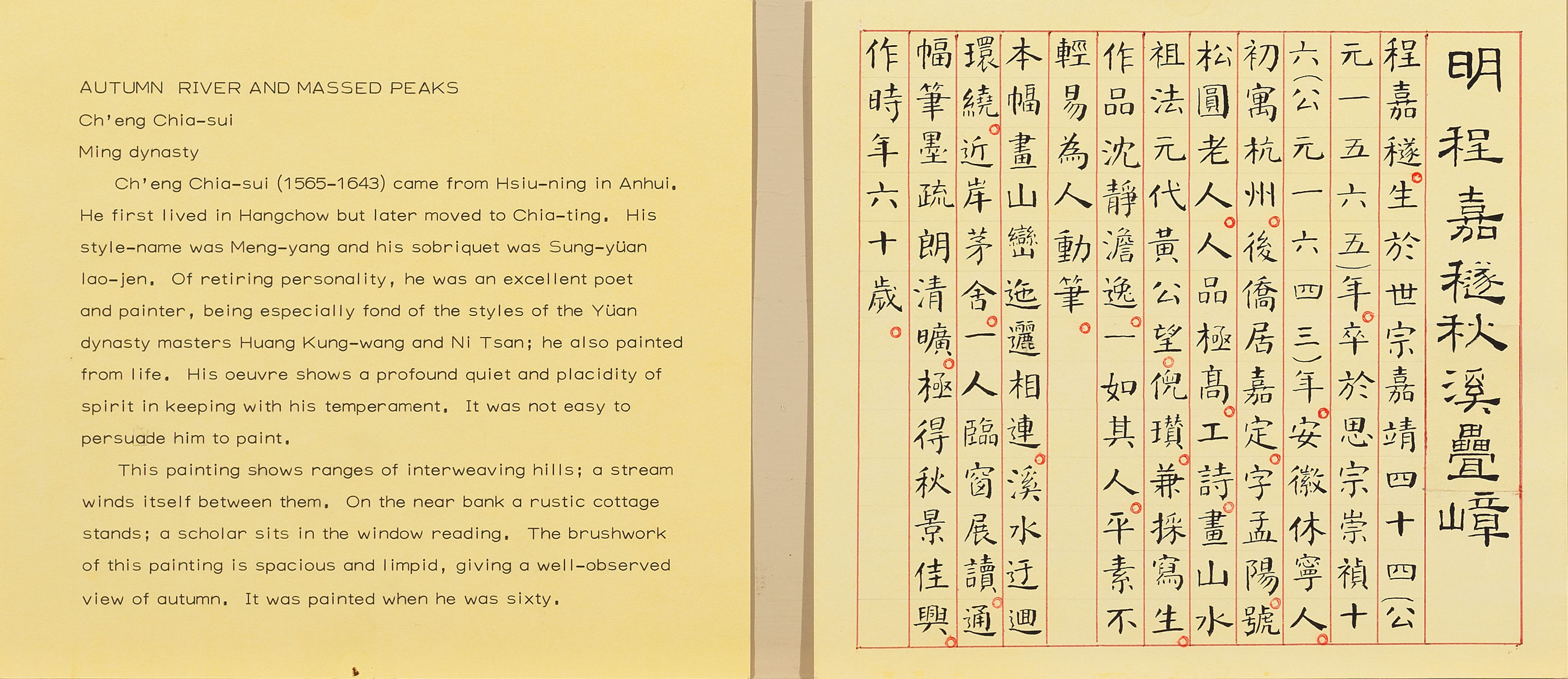
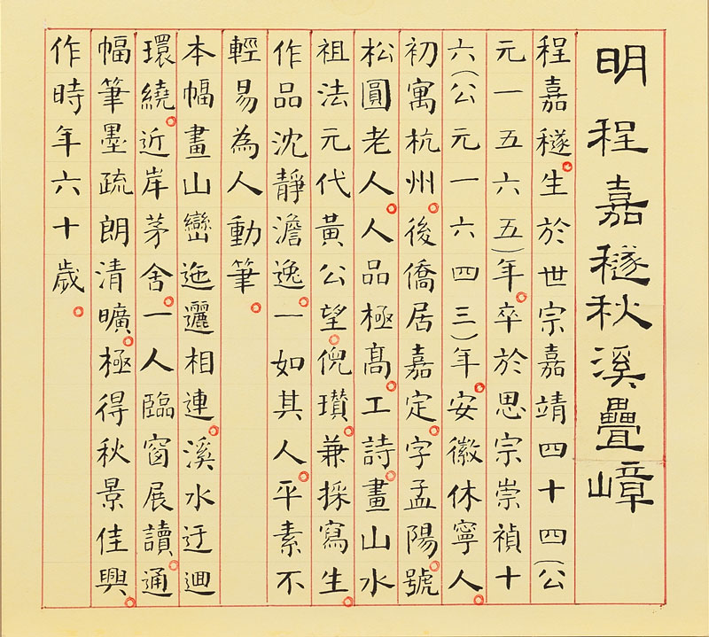
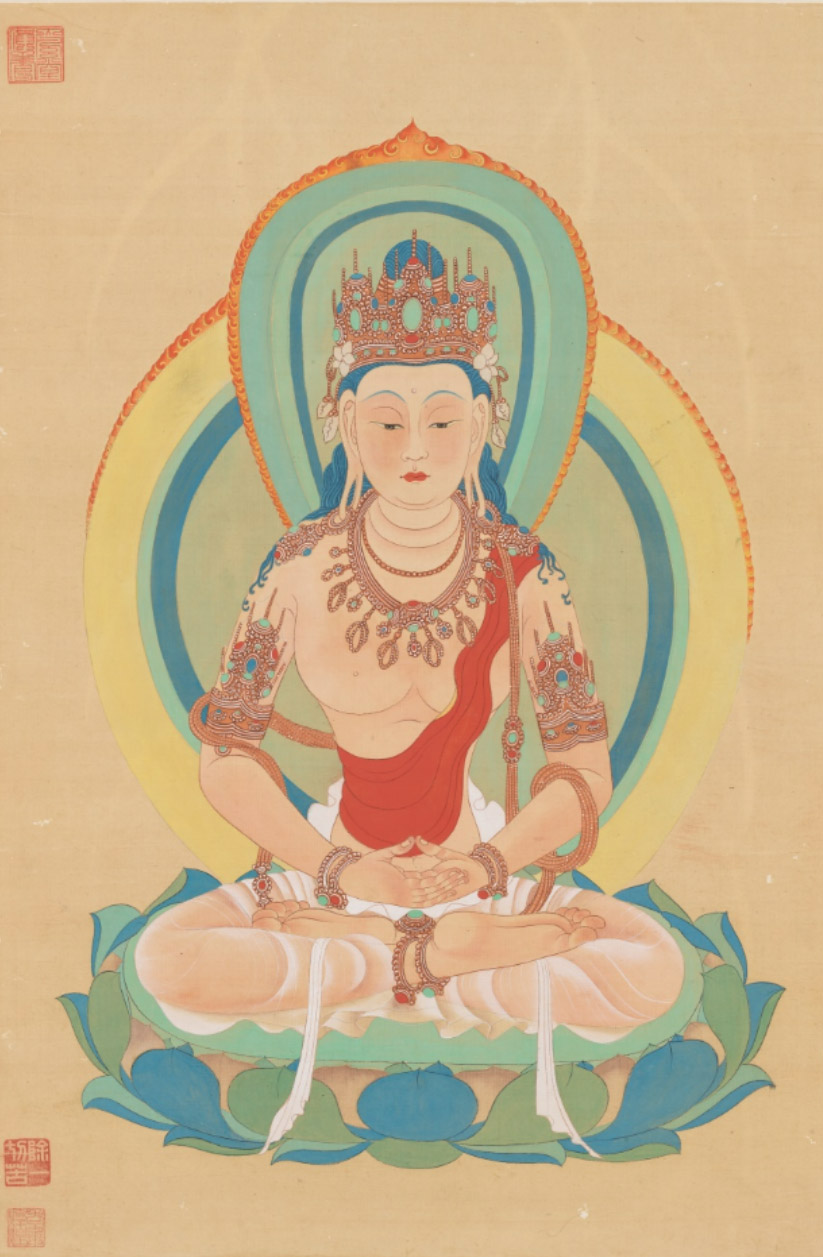
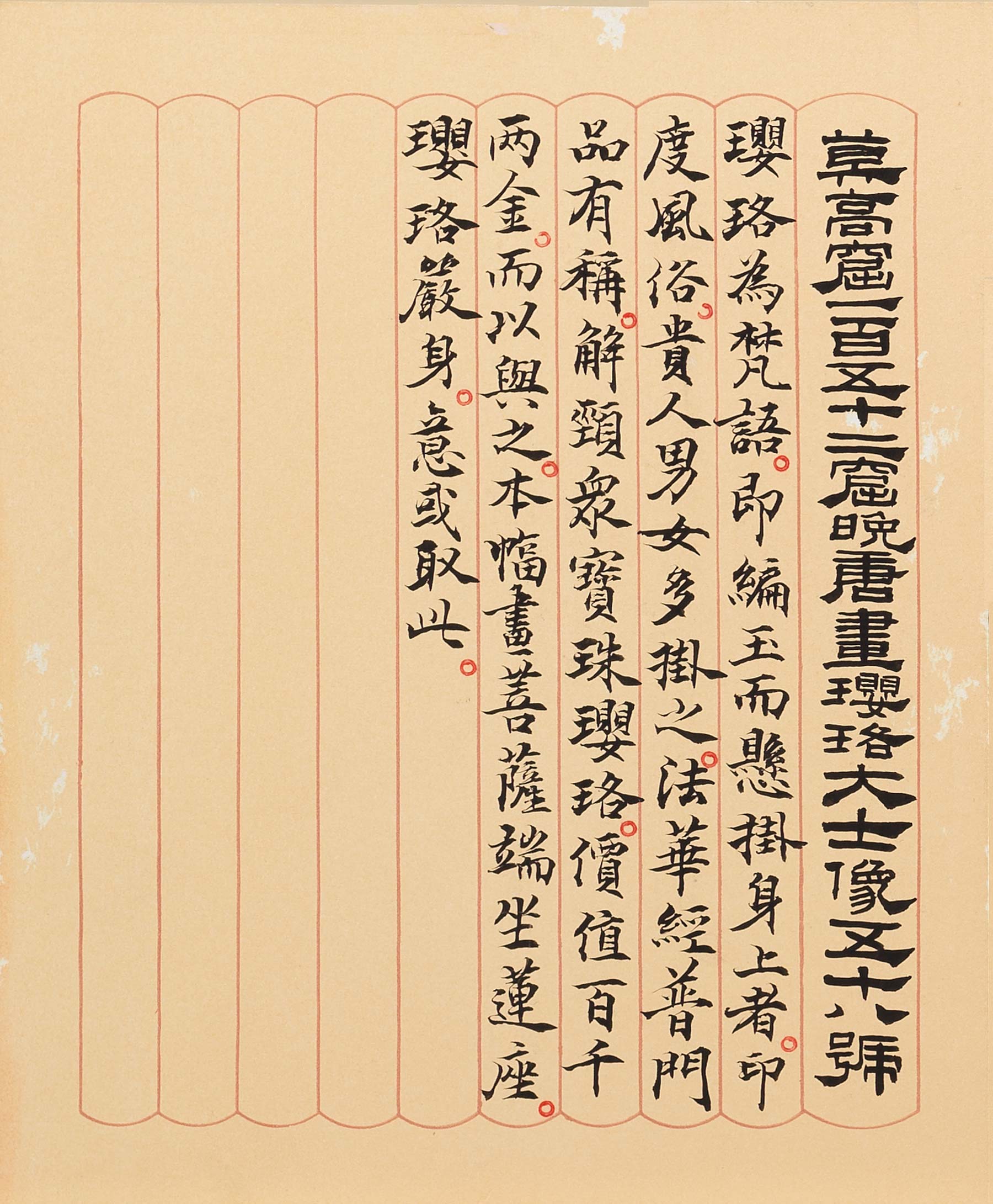
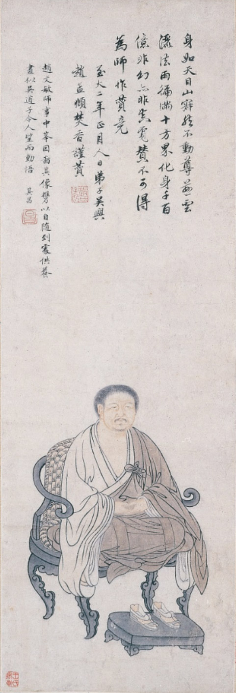
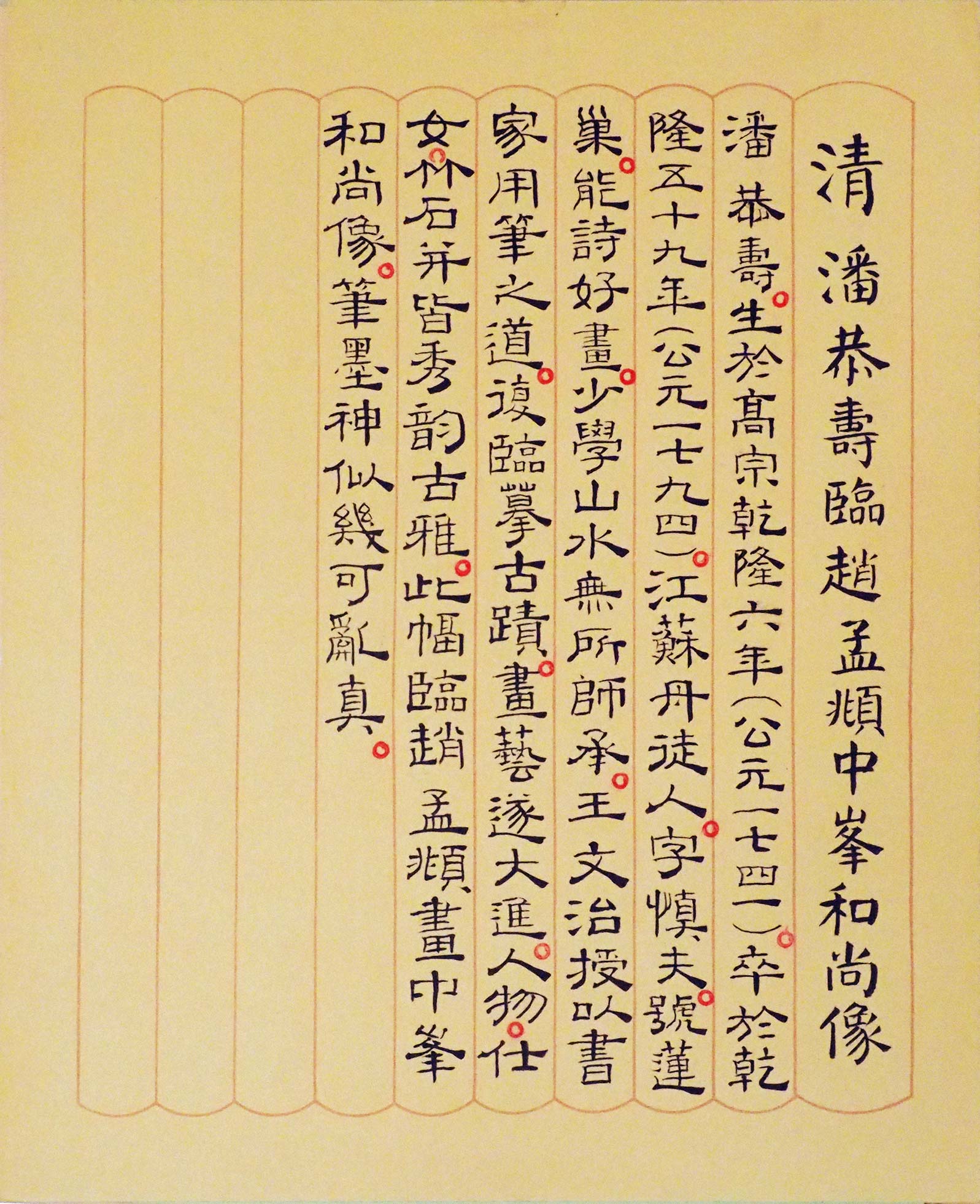
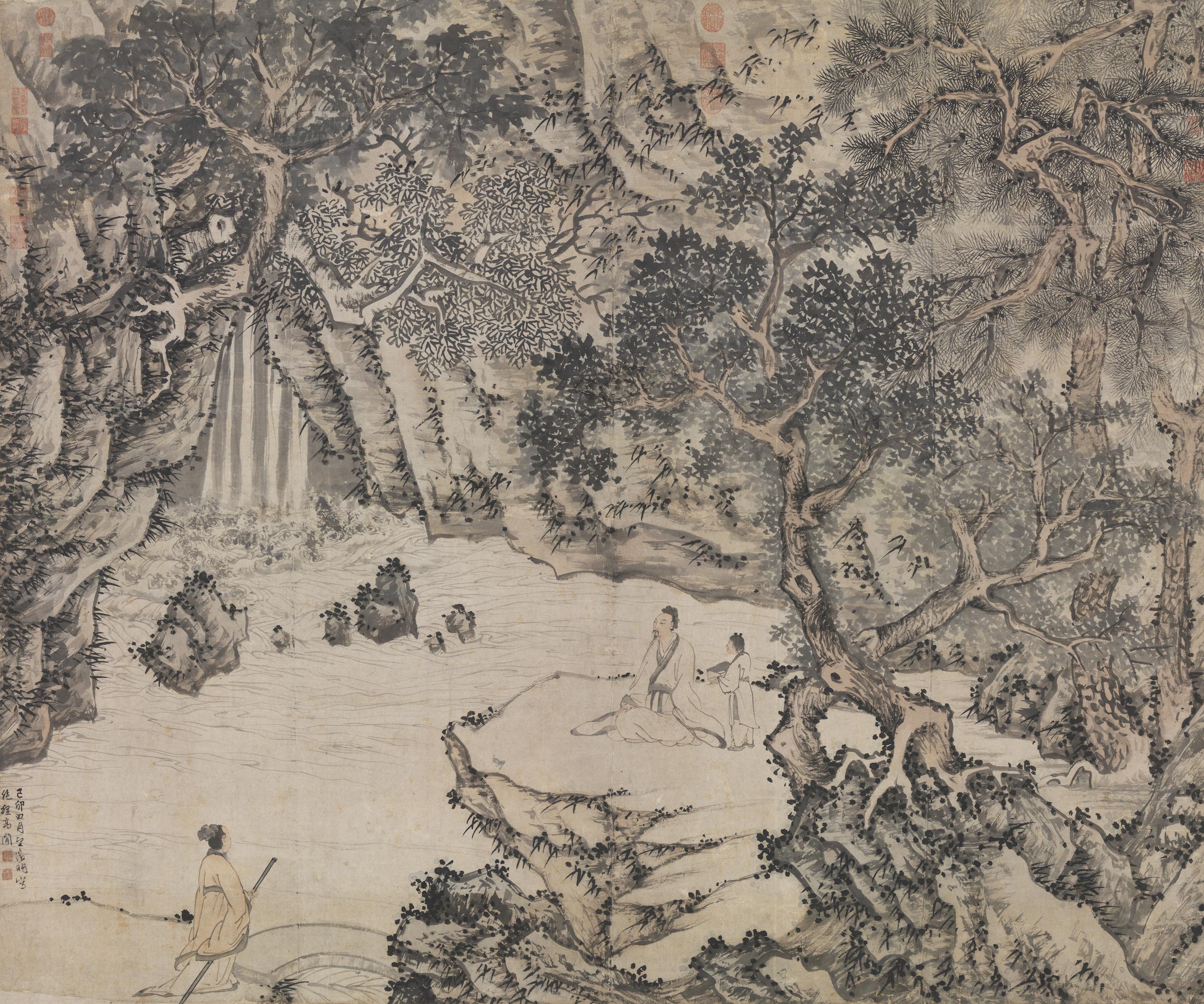
In gratitude to Chang Dai-chien and Lin Po-shou for entrusting and donating works to the National Palace Museum, the east and west third-floor pavilions of the Museum were converted into display galleries in 1970 and named the "Ta-feng Pavilion" and "Lan-ch'ien Pavilion," which were devoted to displaying the masterpieces entrusted and donated by them. Chang Dai-chien's copy of a late Tang dynasty Avalokitesvara bodhisattva wall painting from Dunhuang and Pan Gongshou's copy of Zhao Mengfu's portrait of the Buddhist monk Zhongfeng were displayed there in April 1971. The two museum labels here are most likely the ones accompanying these two works at the time.
During this period, the lines for the columns could be printed onto the cards, meaning that it was no longer necessary to use a ball-point pen to do all the lines by hand in red ink. Of particular note, the top and bottom of each column has a concave line forming an arched shape, which perhaps was intended to suggest curved slips of bamboo, an early medium for writing Chinese.
3. Labels Written by Calligraphers
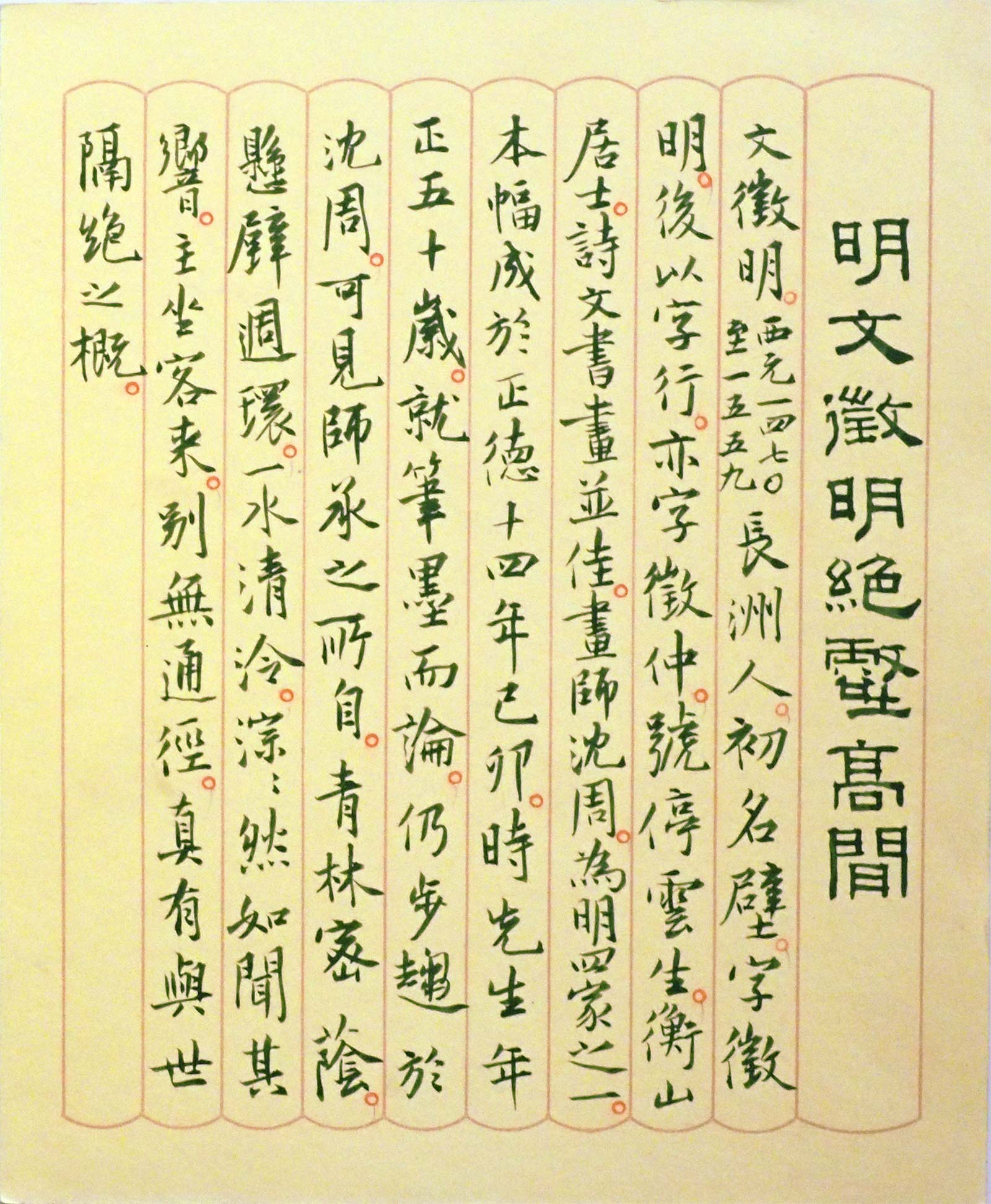
Early explanatory labels for displays of painting and calligraphy at the National Palace Museum were written in brush and ink using a clear format and upright brushwork. So who wrote these early handwritten labels? Judging from the style of calligraphy and related documentary sources, they were done by such early researchers in the Department of Painting and Calligraphy as Chiang Chao-shen, Fu Shen, She Cheng, and Chang Kuang-pin, who were artists themselves with considerable talent in calligraphy. In addition to preparing explanations for the exhibit works, they had to spend much time to plan and transcribe them into beautiful writing. These museum labels represent a time in the past and can actually be considered works of art in their own right, thus giving them special meaning.
4. Dragon-Border Explanatory Labels: From Handmade to Printed
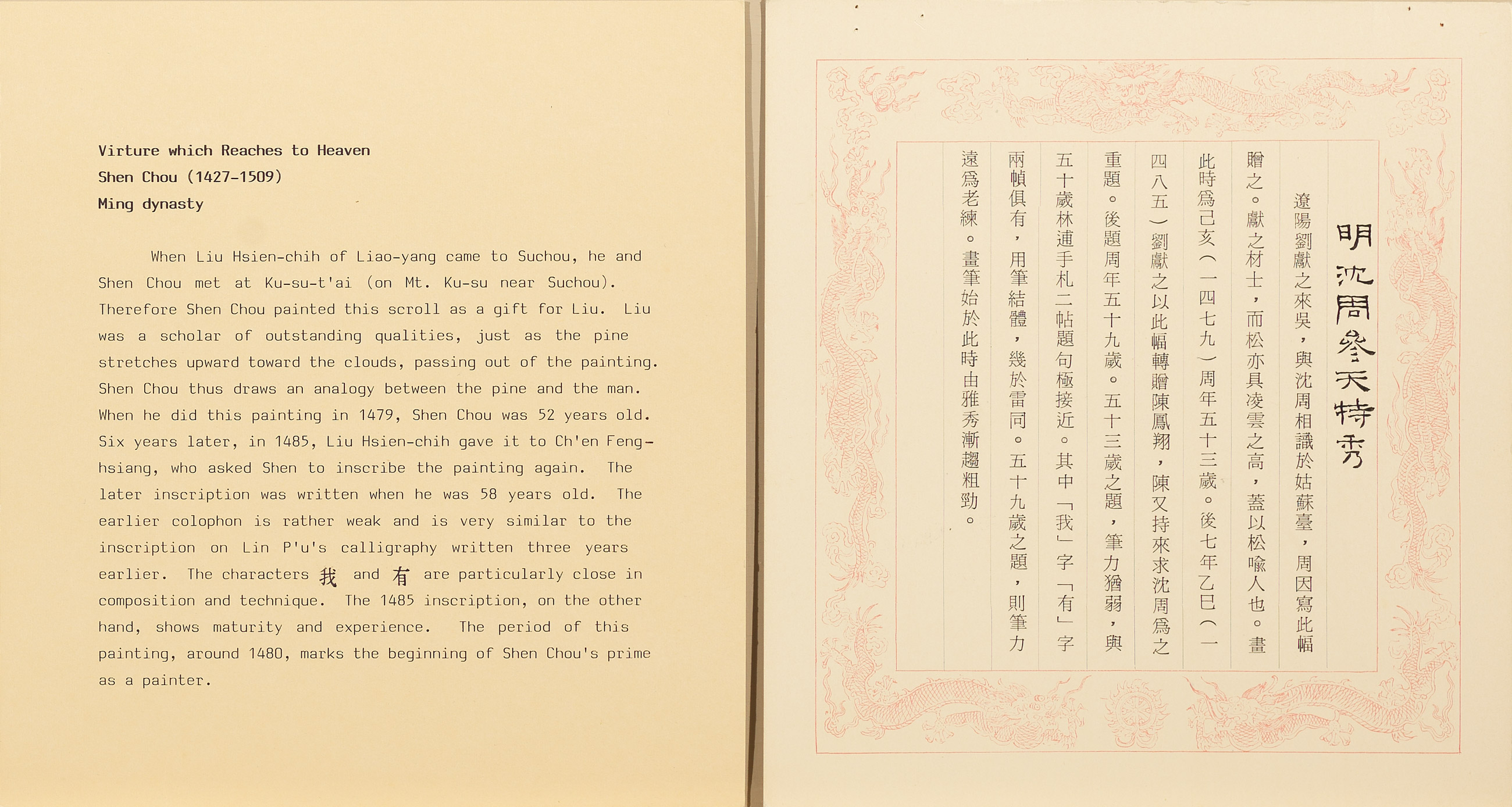
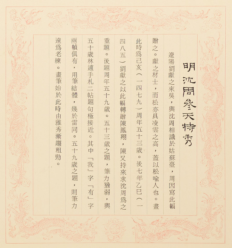
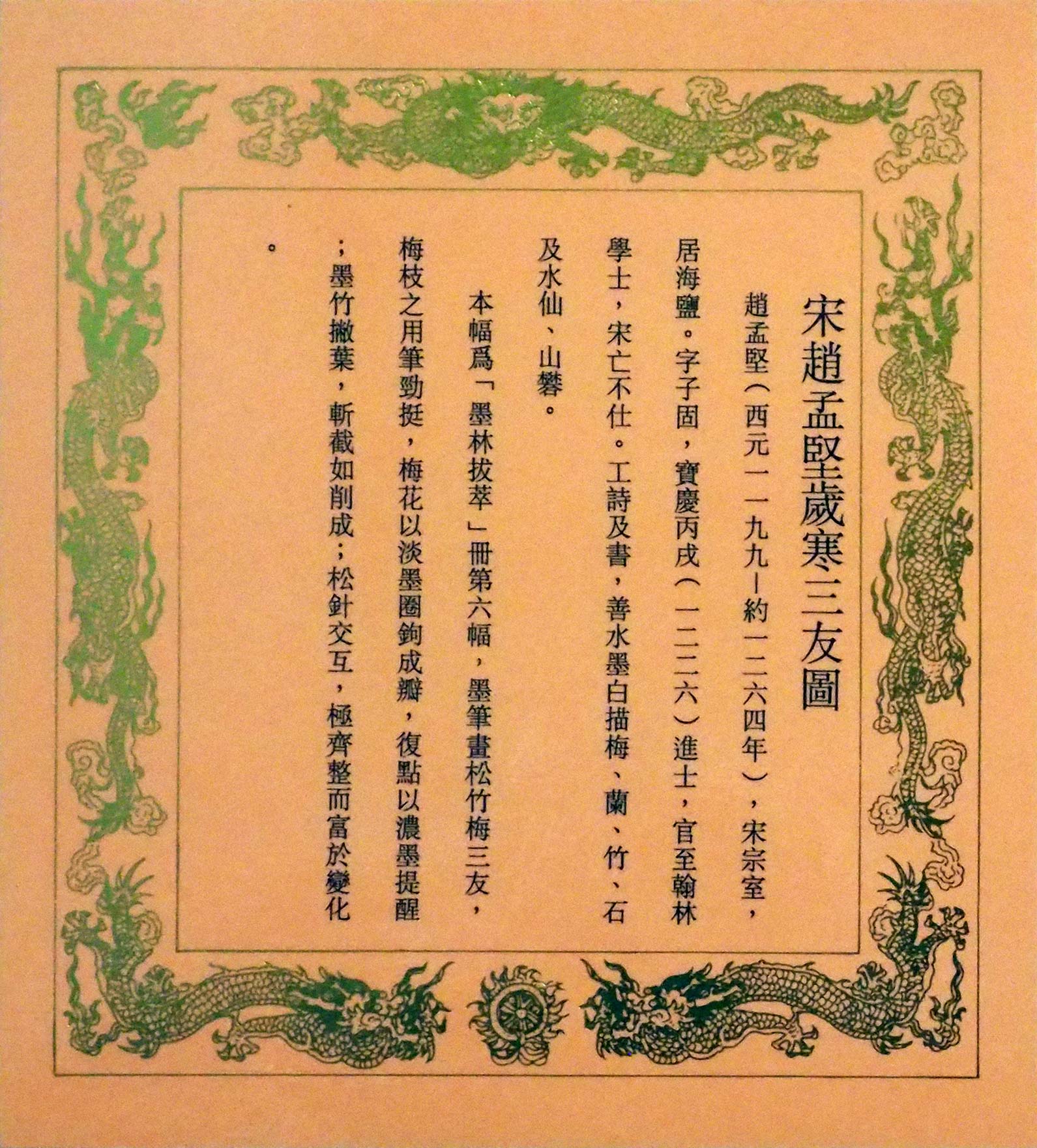
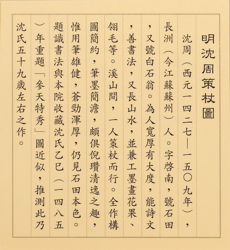
There is also a group of explanatory labels with dragon-decorated borders used at the National Palace Museum from the 1980s to the 1990s. Although they look similar to each other, they ideally reflect the changes in word-processing that took place at this time in Taiwan and the dramatic influence on producing explanatory cards. The area for writing on these dragon-border cards was reduced considerably compared to earlier versions, and though some cards in Chinese were still written in brush and ink, the characters also became smaller. Afterwards, only the title line was written in clerical script, the text portion changed to being typed on a typewriter. And even later the Chinese contents were then photo-typeset and printed on the card.
5. Pursuing Audience-Friendly Museum Labels
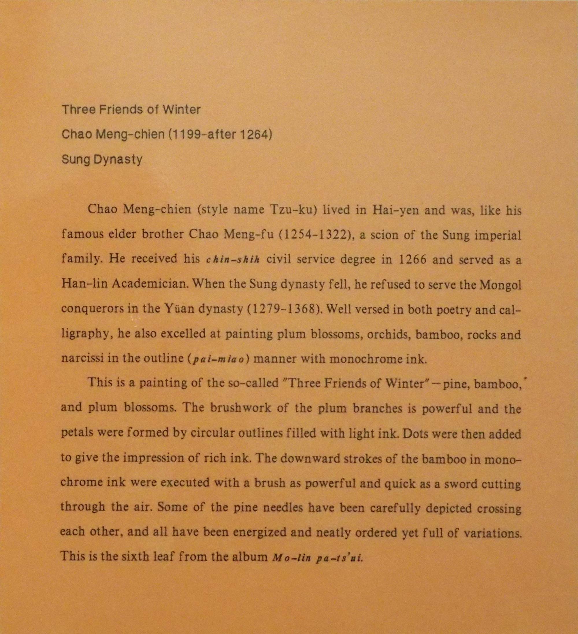
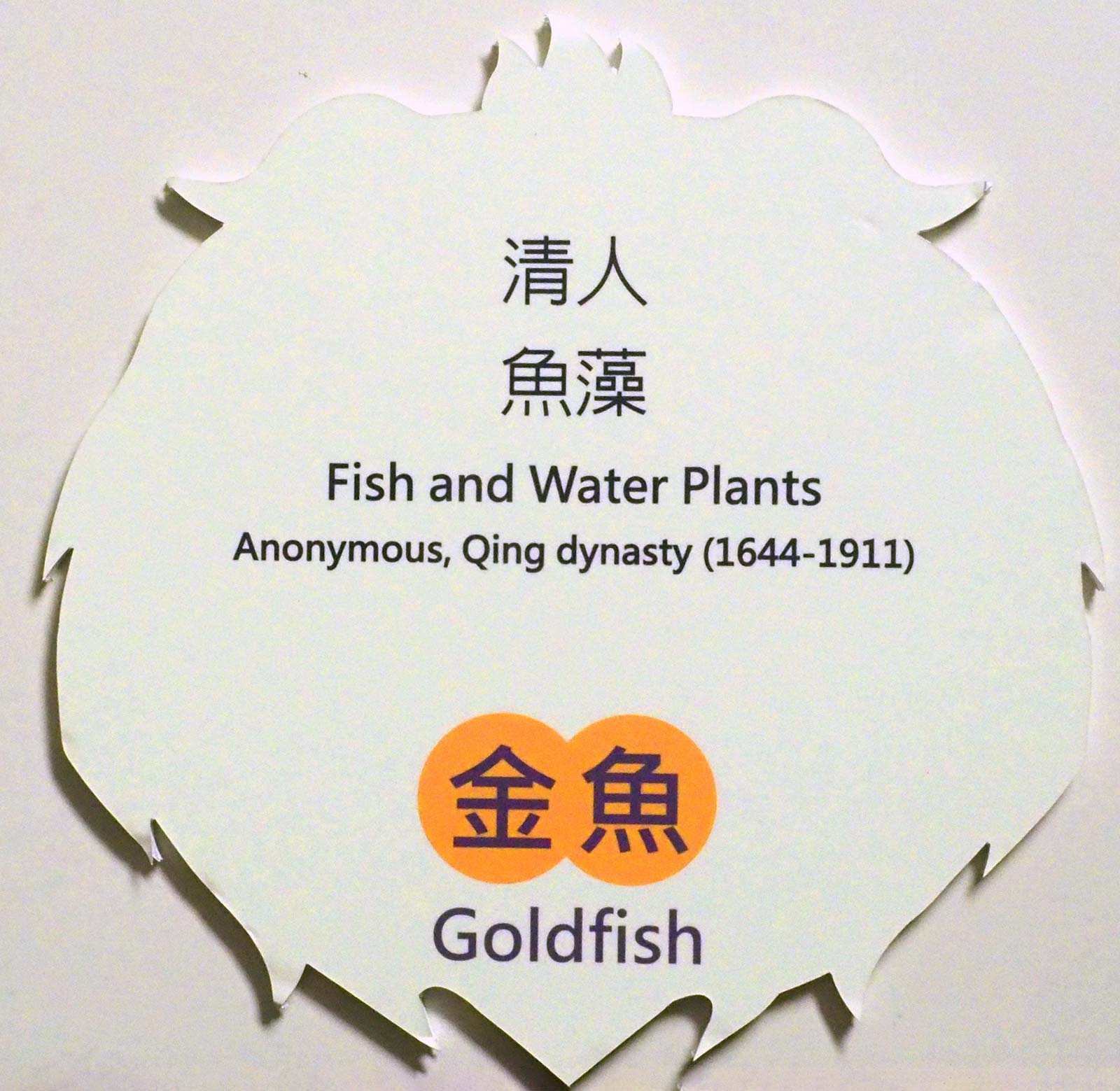
Starting around 2000, dragon-border explanatory cards were phased out to make way for cards that make it easier for visitors to read and understand the contents. In place of the dragon border, a simple line was used and the size of the writing increased as much as possible, the use of words also gradually becoming closer to everyday language. Placed one above the other within an acrylic frame, the Chinese label and its English translation could be fixed together.
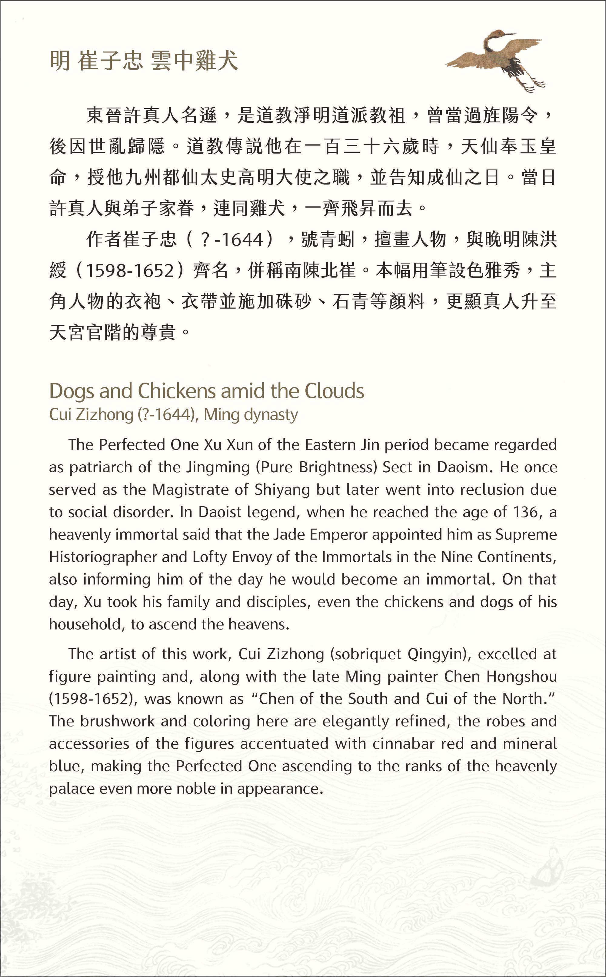
In recent years, the increasing convenience of laser and digital printing has made it easier to add special designs to the cards, thereby individualizing them for different exhibition themes. As a result, the English translation can be included with the Chinese on the same card. And as long as the card design does not detract from the exhibition pieces, it offers important related information to the audience in an eye-pleasing way.
-
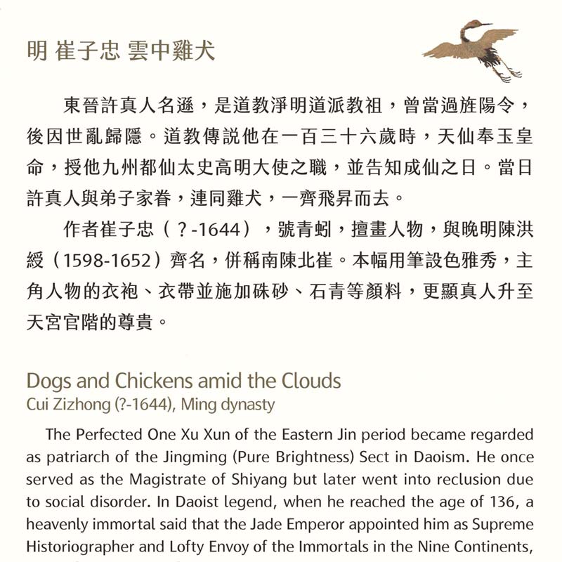
This explanatory card was prepared for the "Whereto Paradise: Picturing Mountains of Immortality in Chinese Art" special exhibition that opened in July of 2018. The contents were written by Assistant Researcher Hsu Wen-mei and translated into English by Donald E. Brix. Assistant Researcher Lin Tzu-yin of the Department of Education, Exhibition and Information Services designed the card.
